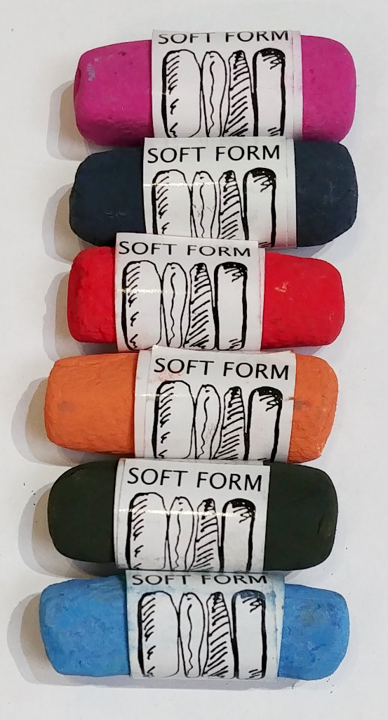
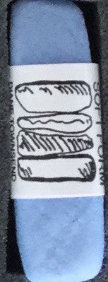
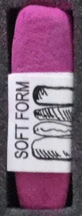
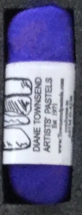
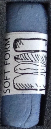
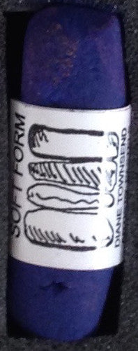
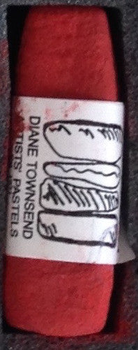
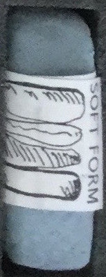
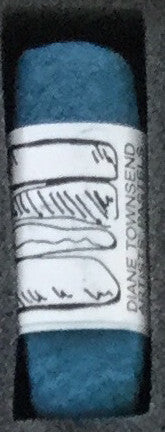
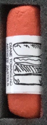
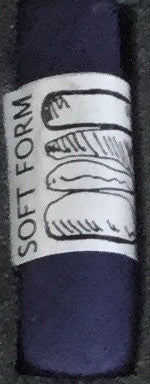
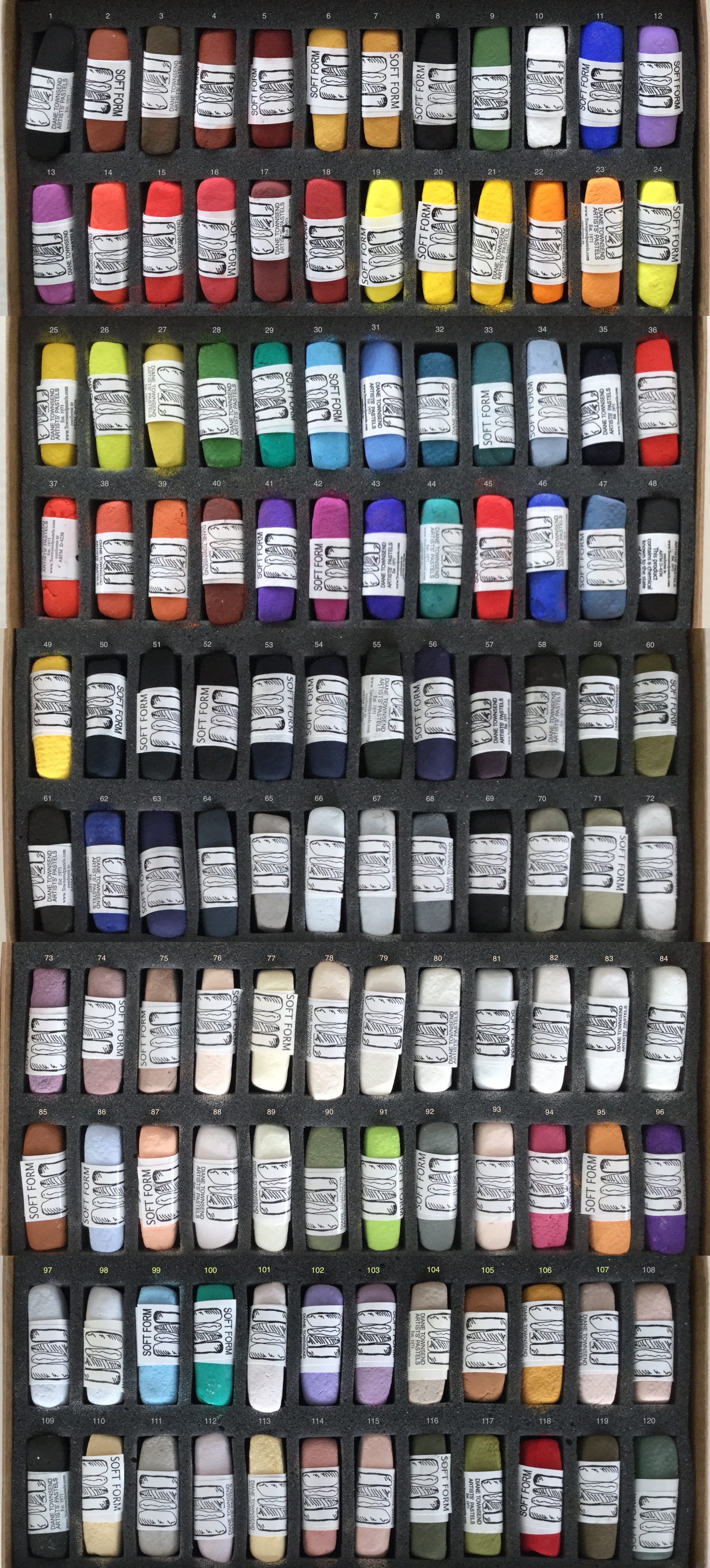
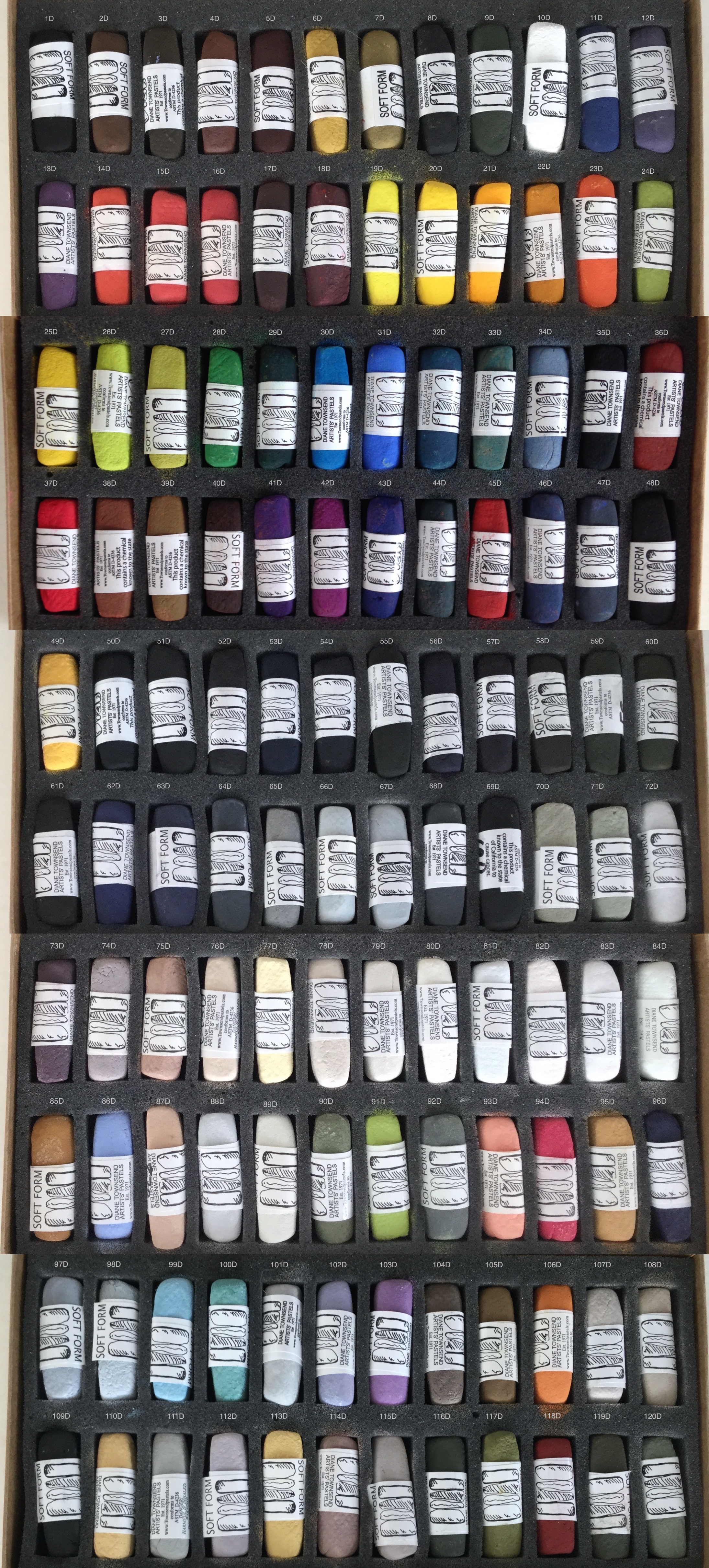
The soft form palette contains both classical artists’ colors such as raw umber, ultramarine blue and cadmium red, and an exotic and vivid range of modern pigments such as naphthol red and the fluorescent pigments. I start with the pure shade of each color, of which there are about 35 different pigments that I use, and I create mixes based on the pigments that work well together and look beautiful for artists today. You will find a Viridian hue(using Phthalo Green and a blue) and Alizarin hues (using Quinacridone magenta) reminiscent of Tintaretto and pale earth tones and greens based on Morandi’s paintings. I created the off blacks based on 19th century Navaho blankets and the off whites as one might see in Robert Ryman’s paintings. I worked as a figurative painter for 25 years and I developed colors hard to find in commercial pastels, in particular delicate pale tones observable on the surface of water or glass or skin color and the very dark tones to contrast the light. When I moved into abstract painting my attitude towards color became one of ” the simpler the better”. I mix color as a painter mixes color using red and green and white to make grays, or violet and orange. By using complimentary colors to create tonal variations one obtains a silvery light and richness of pigmentation. My colors are not necessarily mixed out of gradations of white or black, but based on the relative nature of color and how color looks next to other colors. I will talk more about this on my blog!
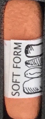
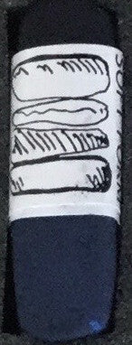
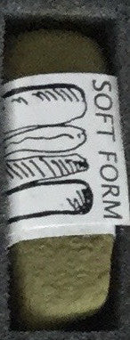
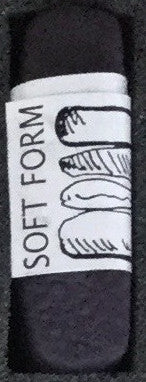
We have begun making all of our pastels with a new formula that is less dusty, adheres to the surface better, and is gritty. I like to describe them as smooth rather than soft, although some pigments such as mars black are so soft by nature one has to compensate for it. Adding chalk or talc can make pastels soft and buttery but pigments aren’t like that naturally, except for the oxides. My new formulas are aimed at structuring the pastels for a good even flow, clear colors and less dust! Too much chalk or any additive , even pumice clouds the color and builds up debris on the drawing making it hard to layer and mix your colors.